
3dnirvana is best viewed in Mozilla Firefox 2.0!! The multi browser program for this blog is under development. Wish you all a very happy navigation.

3dnirvana doesn't take any authority over its content. Viewers are free to comment, review and analyze anything under personal right to freedom.

3dnirvana is the creative face of Roshan Kolar, who is a Creative Engineer and an Animator.
Showing posts with label article. Show all posts

STUPID COMPUTER PRANKS TO ANNOY UR FRIEND!!

  1. Unclick-able desktop

    Allright, this one is really old but sometimes users will not know what happened. Just make a screenshot of your desktop by pressing "Print Screen" on your keyboard (sometimes shown as "Print Scrn"). Now go to Paint and Paste (Ctrl+V). You should now have an image of your desktop. Save the image to your PC (not on your desktop) and save it as BMP. You'll now have the file like this: C:/Desktop.bmp.
    Next, right-click on your desktop and select Properties. Select the tab Desktop and click Browse... Navigate to your screenshot and press OK to set it as your background. You're almost done now.
    Right-click your desktop again and navigate to "Arrange icons by" and uncheck "Show desktop icons". There you have it, the icons on the desktop can not be clicked anymore.
  2. Desktop upside down

    Do you still have the image from the previous prank? Open it again in Paint. Now rotate the image (Ctrl+R) and set it to 180 degrees. Save to file again as BMP, like this: C:/Potksed.bmp.
    Now set the image again as your background and there you have it: Your desktop is turned upside down. But wait: The taskbar at the bottom is still there? Right-click on it and select Properties. On the Taskbar tab, select the Auto-hide the taskbar check box. Press OK to save the changes.
  3. Strange sounds

    A PC has some build-in audio files that are played when doing something. For example, when you start navigating you'll hear a "click" and when you disconnect a USB device you'll hear another sound. Change these sounds into something that you want!
    First, search on the internet for the correct audio file (Example: Farts, Screams etc.). If the file is in MP3 format, convert them to WAV. Save the WAV files to C:/WINDOWS/Media/.
    Now go to Start > Settings > Control Panel and double click on "Sounds and Audio Devices". Go to the tab Sounds and look for the correct sound in the list that you want to change. Change it by selecting the event and clicking on Browse... Navigate and select your new WAV file and press OK to save.
    Be creative and your prank will succeed, just like this startup sound prank.
  4. Boogieman

    Normally, WAV files are played with Windows Media Player. In this joke, you don't want this to happen. We'll write a VBS-file (Visual Basic) in this joke that will run audio files that you can't see.
    Open up Notepad and copy the following code:
    strSoundFile = "C:\WINDOWS\Media\[YOURSOUNDFILE].wav"
    Set objShell = CreateObject("Wscript.Shell")
    strCommand = "sndrec32 /play /close" & chr(34) & strSoundFile & chr(34)
    objShell.Run strCommand, 0, False

    Change the [YOURSOUNDFILE] to the sound file you want to play. Now save the file to your harddisk, like this: C:/Sound.vbs. Double-click the VBS file to try if it works.
    You probably want to play these files automaticly. You can do this by creating tasks. Go to Start > All programs > Accessories > System Tools > Scheduled Tasks. A new window will appear. Double click on "Add scheduled task" and follow the instructions. Select your VBS file when the wizard asks if you want to open a software application. You want your PC to scream at 4 AM?
  5. Shortcuts changed

    Pretty corny joke, but still one that can drive other users insane. Shortcuts are nothing more than files pointing to other files that they should startup. For example, if you have a Windows Media Player shortcut on your desktop, right click on the shortcut and select Properties. The Target will be something like:C:/Program Files/Windows Media Player/wmplayer.exe. Change this line into another one, like C:/Program Files/MSN Messenger/msnmsgr.exe for MSN Messenger. Press OK to save the changes.
    Probably the icon will have changed too. No problem about that, you can change that. Right-click the shortcut and select Properties. Choose the Shortcut tab. Click on the Change Icon button and navigate to your previous program, such as Windows Media Player. Click "Open" to select the file and press OK to save.
  6. Format C:

    Formatting is what users are very afraid of. Go to RJLSoftware and download FakeFormat. The title is self-explaining: It'll look like as if you're formatting your PC. Additionally, the creators from this program disallow the functionality of shutting down. Double trouble!
  7. "The Finger"

    And while you're still at RJLSoftware don't forget to download The Finger. This little program will change your cursor into another finger and you'll already have guessed which one it is. Make sure you check the command line options. Place the EXE file in de startup folder of your PC and wait untill other users find out.
  8. Haunted DVD-/CD-Player

    Software can have control over hardware. If you used Nero, you'll probably noticed that, when you're done coping a CD / DVD, the CD / DVD will be ejected automaticly. Why not make use of this function? Go to cd-eject-tool.com and download the program. The specialty about this program, is that you can create shortcuts that directly drive the program. Create a shortcut that opens the CD / DVD drive and put it in the scheduele and wait for your victim.
  9. Melting Desktop

    Go to Soft4fun and download the "ScreenSmelter". When you run this program, it'll look like as if the desktop is melting in front of your nose. Make it a task and nobody will know what happened. Except for you.
  10. Fatal Error

    What can I say, an image (or movie) tells us more than 1000 words. Watch this movie on how to create a fake fatal error message that you can customize.

20 TIPS FOR AN EFFICIENT GOOGLE SEARCH EVER!!!


google legoFor millions of people Google is an indispensable search tool that they use every day, in all facets of their lives. From work or school, research, to looking up movies and celebrities to news and gossip, Google is the go-to search engine.

But instead of just typing in a phrase and wading through page after page of results, there are a number of ways to make your searches more efficient.

Some of these are obvious ones, that you probably know about. But others are lesser-known, and others are known but not often used. Use this guide to learn more about, or be reminded of, some of the best ways to get exactly what you're looking for, and quickly.

  1. Either/or. Google normally searches for pages that contain all the words you type in the search box, but if you want pages that have one term or another (or both), use the OR operator -- or use the "|" symbol (pipe symbol) to save you a keystroke. [dumb | little | man]

  2. Quotes. If you want to search for an exact phrase, use quotes. ["dumb little man"] will only find that exact phrase. [dumb "little man"] will find pages that contain the word dumb and the exact phrase "little man".

  3. Not. If you don't want a term or phrase, use the "-" symbol. [-dumb little man] will return pages that contain "little" and "man" but that don't contain "dumb".

  4. Similar terms. Use the "~" symbol to return similar terms. [~dumb little man -dumb] will get you pages that contain "funny little man" and "stupid little man" but not "dumb little man".

  5. Wildcard. The "*" symbol is a wildcard. This is useful if you're trying to find the lyrics to a song, but can't remember the exact lyrics. [can't * me love lyrics] will return the Beatles song you're looking for. It's also useful for finding stuff only in certain domains, such as
    educational information: ["dumb little man" research *.edu].

  6. Advanced search. If you can't remember any of these operators, you can always use Google's advanced search.

  7. Definitions. Use the "define:" operator to get a quick definition. [define:dumb] will give you a whole host of definitions from different sources, with links.

  8. Calculator. One of the handiest uses of Google, type in a quick calculation in the search box and get an answer. It's faster than calling up your computer's calculator in most cases. Use the +, -, *, / symbols and parentheses to do a simple equation.

  9. Numrange. This little-known feature searches for a range of numbers. For example, ["best books 2002..2007] will return lists of best books for each of the years from 2002 to 2007 (note the two periods between the two numbers).

  10. Site-specific. Use the "site:" operator to search only within a certain website. [site:dumblittleman.com leo] will search for the term "leo" only within this blog.

  11. Backlinks. The "link:" operator will find pages that link to a specific URL. You can use this not only for a main URL but even to a specific page. Not all links to an URL are listed, however.

  12. Vertical search. Instead of searching for a term across all pages on the web, search within a specialized field. Google has a number of specific searches, allowing you to search within blogs, news, books, and much more:

  13. Movies. Use the "movie:" operator to search for a movie title along with either a zip code or U.S. city and state to get a list of movie theaters in the area and show times.

  14. Music. The "music:" operator returns content related to music only.

  15. Unit converter. Use Google for a quick conversion, from yards to meters for example, or different currency: [12 meters in yards]

  16. Types of numbers: Google algorithms can recognize patterns in numbers you enter, so you can search for:

    • Telephone area codes

    • Vehicle ID number (US only)

    • Federal Communications Commission (FCC) equipment numbers (US only)

    • UPC codes

    • Federal Aviation Administration (FAA) airplane registration number (US only)

    • Patent numbers (US only)

    • Even stock quotes (using the stock symbol) or a weather forecast regarding the next five days


  17. File types. If you just want to search for .PDF files, or Word documents, or Excel spreadsheets, for example, use the "filetype:" operator.

  18. Location of term. By default, Google searches for your term throughout a web page. But if you just want it to search certain locations, you can use operators such as "inurl:", "intitle:", "intext:", and "inanchor:". Those search for a term only within the URL, the title,
    the body text, and the anchor text (the text used to describe a link).

  19. Cached pages. Looking for a version of a page the Google stores on its own servers? This can help with outdated or update pages. Use the "cached:" operator.

  20. Answer to life, the universe, and everything. Search for that phrase, in lower case, and Google will give you the answer.

ROBOT - Rajinikanth's 100 Crore Explosive Movie!! Get Ready!!

Rajnikanth strarring ‘Robot’ to be produced by Eros International and Ayangaran

1 Star2 Stars3 Stars4 Stars5 Stars

London, Mumbai, 7th January 2008: Leading integrated Tamil media & entertainment company Ayngaran International, which is an Eros International company, announces the production of Shankar‘s ‘Robot’, starring superstar Rajnikanth.

After the grand success of ‘Shivaji’, Tamil film industry’s most popular star, Rajnikanth, talented director, Shankar, and music maestro, A. R. Rahman, are coming together once again in the much anticipated ‘Robot’.

Expected to be the grandest film ever to be made in Indian cinema, ‘Robot’, will be produced in Tamil, Hindi, Telugu and other languages.

Director, Shankar, commented: “It’s very exciting to be working again with talents like Rajnikanth and A.R. Rahman. Combined with production & distribution muscle of Ayngaran – Eros International, ‘Robot’ has the potential of becoming this year’s biggest film.”

Rajnikanth commented: “I am immensely happy to be working with Ayngaran – Eros International for ‘Robot’. This film by Shankar is one of its kinds to be made on Indian screen. No one has done it before.”

K KarunaMoorthy, CEO of Ayngaran, commented: “After the grand success of ‘Shivaji’ and ‘Billa’ we are all geared up for ‘Robot’ now. Aligning with Eros International’s consolidation strategy, we are leveraging our position to integrate the Tamil film industry by producing & releasing films on the global platform. It’s a pleasure working again with the magical team of Rajnikanth, Shankar and A.R. Rahman. We are positive that ‘Robot’ will break all box office records. “

About Eros International Plc

Eros International plc is an established global player in the fast-growing Indian media and entertainment arena. Being vertically integrated means that Eros not only produces and commissions films like studios but it also distributes and exploits films across formats globally via cinemas, home entertainment, television formats and new media.Established in 1977, Eros International has three decades of market leadership in creating a global platform for Indian cinema. The company operates in over 50 countries with worldwide offices in India, UK, USA, Dubai, Australia, Fiji and Isle of Man. It has built a successful business model around the release of 30-40 new films every year and the exploitation of a film library containing more than 1,300 titles, making it one of the largest content owners in the business.

Global Distribution, Motion Pictures, Music, Home Entertainment, e-Television, New Media and Animation are the main Strategic Business Units of Eros.

Eros successfully completes its 30th year in the business with the Vision of consolidating the fragmented industry, the Strategy of operating a vertically integrated business model.

About Ayngaran International

Ayngaran has been the pioneers in Tamil Film Distribution in theatrical and home video formats in the International Market. The History of Ayngaran business dates back to 1987 when it had the vision to acquire the International Rights across formats of many Tamil films that became blockbusters. The Ayngaran library has over 1500 films including Blockbuster films like “Shivaji”, “Padayappa”, “Chandramukhi”, “Mudhalvan”, “Indian”, “Jeans”, “Boys”, “Pokkiri”, “Gilly”, “Sivakasi”, “Kadalukku Mariyadhai”, “Alaipayuthey”, “Kandukondain Kandukondain”, “Kannathil Muthamittal” and “Billa 2007” amongst others.

Macworld's best debut: Design tool that Flows

Courtesy : Click here

Macworld's best debut: Design tool that Flows

Small businesses are filling in Mac functionality gaps. Meet GridIron, creators of a powerful - and visually stunning - change-management application.


gridiron_software.03.jpg
A Mac on a stick
A new tablet-style Mac is announced at Macworld 2008.


SAN FRANCISCO (FORTUNE Small Business) -- Is it just me, or does it seem telling that the innovative products coming out of this year's Macworld Expo are no longer Apple gear?

Sure, new twists on Apple technology like the Time Machine back-up system, movie downloads for iTunes, or the uber-portable MacBook Hair - sorry, "Air" - are steps forward for the company. Time Machine, in particular, may do small businesses the ultimate favor: It makes it hip to back up your content.

But the innovative products I was struck by at this year's show come from small businesses with little direct contact with Apple Inc. (AAPL, Fortune 500) or Steve Jobs. Many of these operations developed their own solutions to problems posed by Apple equipment - and those solutions are more creative than those Apple came up with itself.

I particularly liked what one company, Ottawa, Ontario-based GridIron Software, is doing with a business automation product called Flow.

Flow is tricky, so stay with me. It attempts to track the relationship between the software on a computer and the files that software creates. It then takes that relationship and graphically displays it so that it can be tracked over time. That display is stored in an ordered list that can be revisited, studied, modified, updated and even rescued from the trash.

Imagine that all the elements that go into this page on this website could be displayed as graphical elements that can be viewed all at once. That means every Word document, every data file, every graphics file, every image file and all the mixes, mashes, composites, whatever of them all, can be seen - and more importantly, manipulated - in real time.

Why would you want that?

Let's say I filed the wrong photograph to go with this story. Hey, I'm a busy guy. Rather than making my poor editor open up the HTML editor, the picture editor, the caption editor and all the other applications that create the elements needed for the image to appear in this page, she can make the changes directly from GridIron's software in one step. Anybody who has ever faced a mountain of revisions when one screw-up leads to errors across dozens of files knows how powerful an idea this is.

Intrigued? Check out their website, gridironsoftware.com, and see for yourself.

"We really tried to make a system that would automate the process of keeping multi-element files organized," says Steve Forte, 37, president of GridIron. He founded the 21-person firm five years ago. "The idea is to allow anybody to see where everything that goes into a file comes from."

Forte loves keeping things organized. He previously worked in the world of grid computing, which allows computers to share processing and other resources to crack problems. He got the idea for GridIron while running his previous business, Creative Shack, which was acquired by Mitel Networks in 2001. Through that company, Forte developed software for everybody from Apple to Sun Microsystems (JAVA, Fortune 500) to IBM (IBM, Fortune 500), and he realized that what the industry needed was a modular way to track what was where on a particular system.

"You learn pretty quickly doing development for big clients that what clogs up most operations is not the first round of a project, but keeping track of the fixes over the life of the deal," Forte says.

In my brief demo and testing of Flow, I found it intuitive, easy to learn, and full of powerful features. For example, I loved being able to see not only all the pieces that go into a given file, but also being able to see the changes in the elements of that file in real time. Very slick.

Gridiron plans to offer a networked version of the Flow software late this year. That will allow several collaborators to track and update multiple files at once.

Honestly, I cannot wait to get my hands on this software and see if it can stand up to some real-world punishment in my own hard-to-organize business.

That's more than I can say for the Time Machine, the MacBook Air, or movie downloads on iTunes.


Installing Mac OS X on a normal PC !!

Installing Mac OS X on a normal PC

Courtesy - Ricky's Web Review

Mac OS x86The news is not… new, but nowadays a lot of tutorials about how to install Apple’s OS X on an x86 computer are available, and the procedure is now followable by (almost) any PC user.

I want to remember to everybody that it’s illegal to install and use OS X without a valid licence. I take no responsability for any invalid use of this tutorial.
In addiction, please take note that the following procedure may cause a data loss, so do only if you know what are you doing.

We’ll see how to install OS X on a Windows XP machine, on a 7Gb dedicated partition. So you have to prepare your hard disk with:

- The first, primary and bootable partition with a normal Win XP installation;
- A second empty NTFS primary partition;
- Any other partition you like.

Please refer to other documentations if you don’t know how to deal with hard drive partitions. You can use, for example, Partition Magic to change your HD partitions… anyway if you are not experienced in partitioning, my tip is stop here ;)

Then, you have to get some software:

1. an Ubuntu Linux Live CD: you can get it, or you can download it… it’s free. A valid alternative to Ubuntu that I found is Knoppix STD: use it if you’ve problems with Ubuntu;
2. VmWare Workstation it’s a commercial application, but a free trial is available;
3. The Deadmoo’s OS X Linux distro: this is available on P2P networks, usually under tiger-x86.tar.bz2 filename. I want to remember again that you’ve no right to download and to use it, if you don’t have a valid Apple’s OS X Licence.

- Boot from Ubuntu (of Knoppix) Live CD;
- Open a Terminal Window, get administrative rights (it should be sufficient to enter the command “sudo su“)… and type:
cfdisk /dev/hda
- The CFdisk utility will start: choose the partition where you want to install OS X (it should be the second one, but please make attention!) and choose “TYPE”. Now write “AF” (without quotes, of course) as type, and confirm changes choosing “WRITE”. The partition you chose will be erased and it’s type will be set to AF (Apple Format).

Now reboot, go back to Windows XP, install and open VmWare.
Create a new “FreeBSD” virtual machine. When asked to choose the primary hard drive for the virtual machine, choose your phisical hard disk; Also add a second hard drive to the virtual machine: the virtual drive inside Deadmoo’s archive; insert your Ubuntu CD and make sure that your phisical DVD/CD-rom reader is enabled in the virtual machine.
Then start the virtual machine and press on ESC as the machine begin, to enter boot menu: choose to boot from CD. Ubuntu should start booting in the virtual machine’s window. On the contrary, if you see Windows starting, immediately turn off the virtual machine and check CD-Rom settings (in this case, the CD boot has not started and your Windows XP is going to start into itself!).

When Ubuntu is ready, open a terminal window and type a command like this:

dd if=/dev/hdb1 of=/dev/hda2/ bs=8192
hdb (2nd hard drive) should be the mounted Deadmoo’s image: our source;
hda2 should be the 2nd partition of the 1st hard drive (our phisical one): the destination.
CHANGE HDB1 and HDA2 with YOUR SETTINGS!

If you’re not sure about partitions, type:
fdisk /dev/hda -l
to get a list of your connected hard drives and relative partitions identifiers.

The process will take about 5-10 minutes. At the end, you can shut down the virtual machine.

Download this file.
It contains a file named chain0. Extract it to the root of your C:\ partition and add the following line:
C:\chain0=”Mac OS X”
to your C:\boot.ini file.

Now reboot your PC and choose Mac OS X at the boot list screen. Then the “Darwin boot” will ask you to select the partition with Mac OS X installed: select it with arrow keys.

Now try to type -s and then enter. If everything goes ok, at the prompt type:
sh /etc/rc
passwd curtis
passwd root
and enter your new password when asked. If anything is wrong, try to boot with -x or without arguments.

Please take note that sometimes it’s needed to boot several times (with -s, -x, or with no arguments) to get OS X work… I don’t know the reason, but it happens!

How to Improve Your Digital Photography Technique

How to Improve Your Digital
Photography Technique

By: Johnny Sinclair


Photography is something that you need to take time and learn. Everybody and anybody can take casual photographs. But if you want to take quality shots, good digital photography technique is needed. Below are some techniques that you can learn to improve your photography skills.

Use the Sun to Light Your Photos
Do you know that natural sunlight is one of the best lightings for great shots with fine details and splendid colors. However you need to take note that extreme sunlight can cast harsh shadows. Also try not to take photos when the sun is directly overhead.

Using the Flash Effectively
The flash is a great tool if you know how to use it effectively. You need to keep a right distance when using the tool. It can't be too near or too far. Often, a digital camera flash has a range of about 3 meters. If the flash is too far, your photos will be too dark. But if your flash are too close, you will cause the subject to be harshly lit.

Get Rid of Red Eyes
Red eye is caused by the flash reflecting off the retina of your subject's eyes. In order to reduce red eye effects, try to take photos in outdoor or into an area with brighter light. Red eye can also be avoided by having the subject look away from the lens.

Camera Positioning
You can change angle and make a bigger impact. Sometimes, a photo can look much better just by approaching it in a different angle. Move your camera in relation to the subject and zoom in or out to change the composition.

Use Lines to Add Depth
You can create interesting perspective and enhance ordinary shots by using straight or curved lines within the frame. This is because lines lead the eye to the center of interest. Also, you can try shooting lines at an angle for unique shots.

Choose a Right Background
A right background can make better photo. Remove objects that connect to the subject and don't use a busy or competing background. Also, watch out for clutter and distracting elements.

Rule of Thirds
Don't center your subject for every shot. It make the photo so boring and uncreative. By using the rule of thirds, you can create more visual interest. You can divide your photo into a tic-tac-toe grid and place the subject at grid intersections.

Golden Hours
Sunrise and sunset are called "Golden Hours" by many photographers. Photos taken at these point are warm and rich. You need to experiment with angles and zoom to find the perfect balance of light.

Take some time and try out some of these digital photography techniques above. Practice makes perfect. Even with a simple digital camera, you can take amazing photos. You just need to have the correct techniques!

Tata Motors unveils the People’s Car - JAI HIND!!!

Tata Motors unveils the People’s Car


A comfortable, safe, all-weather car, high on fuel efficiency & low on emissions


Mr. Ratan N. Tata, Chairman of the Tata Group and Tata Motors, today unveiled the Tata ‘NANO’, the People’s Car from Tata Motors that India and the world have been looking forward to. A development, which signifies a first for the global automobile industry, the People’s Car brings the comfort and safety of a car within the reach of thousands of families. The People’s Car will be launched in India later in 2008.

Speaking at the unveiling ceremony at the 9th Auto Expo in New Delhi, Mr. Ratan N. Tata said, “I observed families riding on two-wheelers – the father driving the scooter, his young kid standing in front of him, his wife seated behind him holding a little baby. It led me to wonder whether one could conceive of a safe, affordable, all-weather form of transport for such a family. Tata Motors’ engineers and designers gave their all for about four years to realise this goal. Today, we indeed have a People’s Car, which is affordable and yet built to meet safety requirements and emission norms, to be fuel efficient and low on emissions. We are happy to present the People’s Car to India and we hope it brings the joy, pride and utility of owning a car to many families who need personal mobility.”

Stylish, comfortable
The People’s Car, designed with a family in mind, has a roomy passenger compartment with generous leg space and head room. It can comfortably seat four persons. Four doors with high seating position make ingress and egress easy.

Yet with a length of 3.1 metres, width of 1.5 metres and height of 1.6 metres, with adequate ground clearance, it can effortlessly manoeuvre on busy roads in cities as well as in rural areas. Its mono-volume design, with wheels at the corners and the powertrain at the rear, enables it to uniquely combine both space and manoeuvrability, which will set a new benchmark among small cars.

When launched, the car will be available in both standard and deluxe versions. Both versions will offer a wide range of body colours, and other accessories so that the car can be customised to an individual’s preferences.

Fuel-efficient engine
The People’s Car has a rear-wheel drive, all-aluminium, two-cylinder, 623 cc, 33 PS, multi point fuel injection petrol engine. This is the first time that a two-cylinder gasoline engine is being used in a car with single balancer shaft. The lean design strategy has helped minimise weight, which helps maximise performance per unit of energy consumed and delivers high fuel efficiency. Performance is controlled by a specially designed electronic engine management system.


Meets all safety requirements
The People’s Car’s safety performance exceeds current regulatory requirements. With an all sheet-metal body, it has a strong passenger compartment, with safety features such as crumple zones, intrusion-resistant doors, seat belts, strong seats and anchorages, and the rear tailgate glass bonded to the body. Tubeless tyres further enhance safety.

Environment-friendly
The People’s Car’s tailpipe emission performance exceeds regulatory requirements. In terms of overall pollutants, it has a lower pollution level than two-wheelers being manufactured in India today. The high fuel efficiency also ensures that the car has low carbon dioxide emissions, thereby providing the twin benefits of an affordable transportation solution with a low carbon footprint.
(For more information: www.tatapeoplescar.com )

About Tata Motors
Tata Motors is India's largest automobile company, with revenues of US $ 7.2 billion in 2006-2007. With over 4 million Tata vehicles plying in India, it is the leader in commercial vehicles and the second largest in passenger vehicles. It is also the world's fifth largest medium and heavy truck manufacturer and the second largest heavy bus manufacturer. Tata cars, buses and trucks are being marketed in several countries in Europe, Africa, the Middle East, South Asia, South East Asia and South America. Tata Motors and Fiat Auto have formed an industrial joint venture in India to manufacture passenger cars, engines and transmissions for the Indian and overseas markets; Tata Motors also has an agreement with Fiat Auto to build a pick-up vehicle at Córdoba, Argentina. The company already distributes Fiat branded cars in India. Tata Motors’ international footprint includes Tata Daewoo Commercial Vehicle Co. Ltd. in South Korea; Hispano Carrocera, a bus and coach manufacturer of Spain in which the company has a 21% stake; a joint venture with Marcopolo, the Brazil-based body-builder of buses and coaches; and a joint venture with Thonburi Automotive Assembly Plant Company of Thailand to manufacture and market pick-up vehicles in Thailand. Tata Motors has research centres in India, the U.K., and in its subsidiary and associate companies in South Korea and Spain.

(For free broadcast-standard and streaming quality video content about Tata Motors, please log onto www.thenewsmarket.com/tatamotors. You can preview and request broadcast-standard video which will be delivered digitally or by tape. Registration and video is free to the media.)

9 Essential Principles for Good Web Design!!

9 Essential Principles for Good Web Design

In Designing by Collis

Web design can be deceptively difficult. Getting a design that is both usable and pleasing, delivers information and builds brand, is technically sound and visually coherent...

Add to this, the fact that many web designers (myself included) are self taught, that web design is still novel enough to be only a side subject in many design institutions and that the medium changes as frequently as the underlying technology does.

So today I've put together my 9 principles for good web design, it's only my opinions and I've tried to link off to more reading on subjects so you don't only hear my voice. Obviously I have lots of disclaimers, rules are made to be broken, different types of design work differently, I don’t always live up to my own advice etc etc. So please read these as they are intended, just some observations I am sharing...


Capture the Valley uses bars of colour to guide your eye through sections from top to bottom...

1. Precedence (Guiding the Eye)

Good web design, perhaps even more than other type of design, is about information. One of the biggest tools in your arsenal to do this is precedence. When using a good design, the user should be led around the screen by the designer. I call this precedence and it's about how much visual weight different parts of your design have.

A simple example of precedence is that in most sites the first thing you see is the logo. This is often because it’s large and set at what has been shown in studies to be the first place people look (the top left). This is a good thing since you probably want a user to immediately know what site they are viewing.

But precedence should go much further. You should direct the user’s eyes through a sequence of steps. For example you might want your user to go from logo/brand to a primary positioning statement to punchy image to give the site personality to main body text, with navigation and a side bar taking a secondary position in the sequence.

What your user should be looking at is up to you, the web designer, to figure out.

To achieve precedence you have many tools at your disposal:

  • Position - Where something is on a page clearly influences in what order the user sees it
  • Colour – Using bold and subtle colours is a simple way to tell your user where to look
  • Contrast – Being different makes things stand out, being the same makes them secondary.
  • Size – Big takes precedence over little (unless everything is big, in which case little might stand out thanks to Contrast)
  • Design Elements – if there is a gigantic arrow pointing at something, guess where the user will look?

Further Reading:

You can read more of my thoughts on Precedence in an old PSDTUTS post called Elements of Great Web Design - the polish. Joshua David McClurg-Genevese discusses principles of good web design and design at Digital-Web. Joshua also has the longest name ever :-)


Marius has a very clean, very simple site with plenty of space

2. Spacing

When I first started designing I wanted to fill every available space up with stuff. Empty space seemed wasteful. In fact the opposite is true.

Spacing makes things clearer. In web design there are three aspects of space that you should be considering:

  • Line Spacing
    When you lay text out the space between the lines directly affects how readable it appears. Too little space makes it easy for your eye to spill over from one line to the next, too much space means that when you finish one line of text and go to the next your eye can get lost. So you need to find a happy medium. You can control line spacing in CSS with the 'line-height' selector. Generally I find the default value is usually too little spacing. Line Spacing is technically called leading (pronounced ledding) from the process that printers used to use to separate lines of text in ye olde days - by placing bars of lead between the lines.
  • Padding
    Generally speaking text should never touch other elements. Images for example should not be touching text, neither should borders or tables. Padding is the space between elements and text. The simple rule here is that you should always have space there. There are exceptions of course, in particular if the text is some sort of heading/graphic or your name is David Carson :-) But as a general rule, putting space between text and the rest of the world makes it infinitely more readable and pleasant.
  • White Space
    First of all, white space doesn't need to be white. The term simply refers to empty space on a page (or negative space as it's sometimes called). White space is used to give balance, proportion and contrast to a page. A lot of white space tends to make things seem more elegant and upmarket, so for example if you go to an expensive architect site you'll almost always see a lot of space. If you want to learn to use whitespace effectively, go through a magazine and look at how adverts are laid out. Ads for big brands of watches and cars and the like tend to have a lot of empty space used as an element of design.

Further Reading:

At WebDesignFromScratch there is a great article called the Web 2.0 how-to design guide which discusses Simplicity - a concept that makes a lot of use of spacing. There's plenty of other useful stuff there too!


Noodlebox does a good job of using on/off states in their navigation to keep the user oriented

3. Navigation

One of the most frustrating experiences you can have on a website is being unable to figure out where to go or where you are. I'd like to think that for most web designers navigation is a concept we've managed to master, but I still find some pretty bad examples out there. There are two aspects of navigation to keep in mind:

Navigation - Where can you go?
There are a few common sense rules to remember here. Buttons to travel around a site should be easy to find - towards the top of the page, easy to identify - they should look like navigation buttons, and well described - the text of a button should be pretty clear as to where it's taking you. Aside from the common sense, it's also important to make navigation usable. For example if you have a rollover submenu, ensuring a person can get to the submenu items without losing the rollover is important. Similarly changing the colour or image on rollover is excellent feedback for a user.

Orientation - Where are you now?
There are lots of ways you can orient a user so there is no excuse not to. In small sites it might be just a matter of a big heading or a 'down' version of the appropriate button in your menu. In a larger site you might make use of bread crumb trails, sub headings and a sitemap for the truly lost.

Further Reading:

SmashingMagazine has a selection of CSS-based navigation styles which are nice to go through - and #3 is one of mine! AListApart also has a good article about orientation called Where Am I?

4. Design to Build

Life has gotten a lot easier since web designers transitioned to CSS layouts, but even now it's still important to think about how you are going to build a site when you're still in Photoshop. Consider things like:

  • Can it actually be done?
    You might have picked an amazing font for your body copy, but is it actually a standard HTML font? You might have a design that looks beautiful but is 1100px wide and will result in a horizontal scroller for the majority of users. It's really good to know what can and can't be done, which is why I believe all web designers should also build sites, at least sometimes.
  • What happens when a screen is resizes?
    Do you need repeating backgrounds, how will they work? Is the design centred or left aligned?
  • Are you doing anything which is technically difficult?
    Even with CSS positioning, some things like vertical alignment are still a bit painful and sometimes best avoided.
  • Could small changes in your design greatly simplify how you build it?
    Sometimes moving an object around in a design can make a big difference in how you have to code your CSS later. In particular when elements of a design cross over each other it adds a little complexity to the build. So if your design has say three elements and each element is completely separate from each other, it would be really easy to build. On the other hand if all three overlap each other, it might still be easy, but will probably be a bit more complicated. You should find a balance between what looks good and small changes that can simplify your build
  • For large sites particularly, can you simplify things?
    There was a time when I used to make image buttons for my sites. So if there was a download button for example I would make a little download image. In the last year or so I've switched to using CSS to make my buttons and have never looked back. Sure it means my buttons don't always have the flexibility I might wish for, but the savings in build time from not having to make dozens of little button images are huge.

If anyone knows good type it's iLoveTypography!

5. Typography

Text is the most common element of design, so it's not surprising that a lot of thought has gone into it. It's important to consider things like:

  • Font Choices - Different types of fonts say different things about a design. Some look modern, some look retro. Make sure you are using the right tool for the job.
  • Font sizes - Years ago it was trendy to have really small text. Happily these days people have started to realise that text is meant to be read, not just looked at. Make sure your text sizes are consistent, large enough to be read, and proportioned so that headings and sub headings stand out appropriately.
  • Spacing - As discussed above, spacing between lines and away from other objects is important to consider. You should also be thinking about spacing between letters, though on the web this is of less importance as you don't have that much control.
  • Line Length - There is no hard and fast rule, but generally your lines of text shouldn't be too long. The longer they go for, the harder they are to read. Small columns of text work much better (think about how a newspaper lays out text)
  • Colour - One of my worst habits if making low contrast text. It looks good, but doesn't read so well unfortunately. Still I seem to do it with every website design I've ever made, tsk tsk tsk.
  • Paragraphing - Before I started designing I loved to Justify everything. It made for nice edges on either side of my paragraphs. Unfortunately justified text tends to create weird gaps between words where they have been auto-spaced. This isn't nice for your eye when reading, so stick to Left-aligned unless you happen to have a magic body of text that happens to space out perfectly.

Further Reading:

Nick La at WebDesignerWall has a great article about online typography called Typographic Contrast and Flow


Happycog know usability inside out, their own site is simple and easy to use.

6. Usability

Web design ain't just about pretty pictures. With so much information and interaction to be effected on a website, it's important that you the designer, provide for it all. That means making your website design usable.

We've already discussed some aspects of usability - navigation, precedence, text - here are three more important ones:

  • Adhering to Standards
    There are certain things people expect, not giving them causes confusion. For example, if text has an underline, you expect it to be a link. Doing otherwise is not good usability practice. Sure you can break some conventions, but most of your website should do exactly what people expect it to do!
  • Think about what users will actually do
    Prototyping is a common tool used in design to actually 'try' out a design. This is done because often when you actually use a design you notice little things that make a big difference. ALA had an article a while back called Never Use a Warning When You Mean Undo which is an excellent example of a small interface design decision that can make life suck for a user.
  • Think about user tasks
    When a user comes to your site what are they actually trying to do? List out the different types of tasks people might do on a site, how they will achieve them, and how easy you want to make it for them. This might mean having really common tasks on your homepage (e.g. 'start shopping', 'learn about what we do' etc) or it might mean ensuring something like a search box is always easily accessible. At the end of the day your web design is a tool for people to use, and people don't like using annoying tools!

Further Reading:

AListApart has lots of articles on web usability
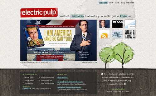

Electric pulp manages to look rough, but if you look closely you realise there is a firm grid and things actually all line up

7. Alignment

Keeping things lined up is as important in web design as it is in print design. That's not to say that everything should be in a straight line, but rather that you should go through and try to keep things consistently placed on a page. Aligning makes your design more ordered and digestible, as well making it seem more polished.

You may also wish to base your designs on a specific grid. I must admit I don't do this consciously - though obviously a site like PSDTUTS does in fact have a very firm grid structure. This year I've seen a few really good articles on grid design including SmashingMagazine's Designing with Grid-Based Approach & AListApart's Thinking Outside The Grid. In fact if you're interested in grid design, you should definitely pay a visit to the aptly named DesignByGrid.com home to all things griddy.


The ExpressionEngine site is the soul of clarity. Everything is sharp and clean

8. Clarity (Sharpness)

Keeping your design crisp and sharp is super important in web design. And when it comes to clarity it's all about the pixels.

In your CSS everything will be pixel perfect so there's nothing to worry about, but in Photoshop it is not so... To achieve a sharp design you have to:

  • Keep shape edges snapped to pixels - This might involve manually cleaning up shapes, lines and boxes if you're creating them in Photoshop.
  • Make sure any text is created using the appropriate anti-aliasing setting - I use 'Sharp' a lot
  • Ensuring contrast is high so that borders are clearly defined
  • Over-emphasizing borders just slightly to exaggerate the contrast.

Further Reading:

I wrote a bit more about clarity in Elements of Great Web Design - the polish. I've noticed print designers transitioning to web design in particular don't think in pixels, but it really is vital.


Veerle does a great job of keeping even the tiniest details consistent across the board

9. Consistency

Consistency means making everything match. Heading sizes, font choices, colouring, button styles, spacing, design elements, illustration styles, photo choices... Everything should be themed to make your design coherent between pages and on the same page.

Keeping your design consistent is about being professional. Inconsistencies in a design are like spelling mistakes in an essay. They just lower the perception of quality. Whatever your design looks like, keeping it consistent will always bring it up a notch. Even if it's a bad design, at least make it a consistent, bad design.

The simplest way to maintain consistency is to make early decisions and stick to them. With a really large site however things can change in the design process. When I designed FlashDen for example, the process took months and by the end some of my ideas for buttons and images had changes so I had to go back and revise earlier pages to match later ones exactly.

Best Animation Schools!!

Best Animation Schools


The following is a list of colleges, universities and tech schools with programs that would help someone in their pursuit of a career in the technical direction of the animation industry or the creative side of animation. The list is dedicated to schools that many animation studios feel caters to technical direction and to the more artistic field of character animation.

Schools for Aspiring Animators

School/College Programs & Training Offered
DeVry University
Bachelor's in Game and Simulation Programming
NATION WIDE
Bachelor's in Game and Simulation Programming
DeVry's Game and Simulation Programming curriculum prepares graduates to join the private and public sector game software industry in a variety of software development roles across the game programming life cycle, including programmer, software engineer and project coordinator. Applications-oriented, the program provides preparation in the math and physics of games; programming fundamentals; game design; modifications (MOD) and massively multi-player online game (MMOG) programming; two- and three-dimensional graphics programming; and simulation and game engine design. Also included is a full complement of general education courses, recommended by game industry experts as critical for well-rounded development team members.

ITT Tech
ITT Tech Online
over 85 locations nationwide
The Digital Entertainment and Game Design program in the School of Drafting and Design at the ITT Technical Institutes can help graduates prepare for career opportunities in a variety of entry-level positions involving the technology associated with the design and development of digital games and multimedia applications. Courses in this program offer a foundation in digital game design through the study of subjects such as gaming technology, game design process, animation, level design and general education coursework.

Graduates of this program may pursue entry-level career opportunities in a number of different digital entertainment and game design companies. Job functions may include working in a team to design, develop, test and produce video games, or create animations and 3D scenes for use in video games.

Animation and Video Game Design DegreeThe Art Institute
Animation & Video Game Design Programs
Online
Animation Program
Animation involves bringing artwork and characters to life with such precision that they truly seem real. Animation is part acting, part storytelling, and part visual art - it's a mix of both electronic arts and traditional animation skills. You'll study methods to create realistic movement in 3-D digital environments, and collaborate within a team environment to gain practical experience. Graduates are prepared to seek entry-level employment such as 3-D character animator, modeler, and storyboarder.

Game Art & Design Program
Graduates are prepared to enter the Game Art and Design field as modelers, storyboard artists, animation artists, 3-D illustrators, digital artists, FX artists, video post-production artists, and broadcast graphics designers, as well as game designers. Learn what it takes to produce great art and design and use the skill to create applications used by the business, education, training and entertainment industries.

Digital Media Arts College
Boca Raton, Florida

Learn from industry experts from leading companies such as SEGA, ImageWorks, Disney, and more. We're one of the United States' most technologically equipped digital artist colleges. We have the tools and techniques to empower your creative career.

Take classes in artist-designed labs and facilities. Learn from experts in digital artistry. Work with industry-standard animation tools, 3D software, and imaging technologies. All at DMAC.


Westwood College of Technology - Online


Online Classes

Westwood College Online offers a diverse curriculum that focuses primarily on the chosen degree field and is enhanced by general education courses. Students receive a truly comprehensive education; our Game Art & Design Program teaches both Maya and 3DS Max, which allows students to work in their preferred format. Many other video game design programs teach only one of these packages. To top it all off, students get exposure to game engines through our program, and this is certainly a benefit to them.

* Conceptualizing and developing ideas for cartoons and animations

* Using life drawing and rendering techniques to develop characters, backgrounds and stories

* Creating 2D and 3D characters and animation for the Web, digital media, television, movies and software

* Utilizing the laws of motion and physics to create life-like motion for the animated characters you create

* Integrating audio and video effects to create animated features

This is just a highlight of our online animation program. Students are prepared for the challenges of a career and provided with skills to navigate the ever-changing trends in animation. Picture yourself in the creative career you have been dreaming of, and work towards that goal with the help of Westwood College Online!
ITT Tech
ITT Tech Online
over 85 locations nationwide
Digital Entertainment and Game Design program:
Graduates of this program may pursue entry-level career opportunities in a number of different digital entertainment and game design companies. Job functions may include working as part of a team to help design, develop, test and produce video games, or create animations and 3D scenes for use in video games.

Collins College
Tempe, AZ
Bachelor's in: Animation, Game Design, Media Arts, Visual Communications and Graphic Design


Ex'pression College for Digital Arts
6601 Shellmound St. Emeryville , CA 94608
Ex'pression Digital Visual Media Program is designed to enhance your knowledge and skills through an intensive series of courses that cover a wide spectrum of digital visual media including 3D modeling and animation, texture and lighting, compositing, digital film and video effects, creating graphics for the Internet and more. You will gain experiential knowledge through extensive lab time using multiple hardware platforms. A one-to-one (student-to-machine) lab ratio allows you to individually explore the intricacies of a wide variety of graphics software.

Westwood Online
Westwood Campus
Anaheim, CA
Upland, CA
Long Beach, CA
Denver, CO
Woodridge, IL
Schiller Park, IL
Calumet City, IL
Chicago, IL
Euless, TX
Houston, TX
Animation, Graphic Design and Multimedia, CAD / Architectural Drafting, Visual Communications and Web Design And Multimedia

IADT - Toronto
Toronto, Ontario
Diploma's in: Computer Animation in Post-Production, Digital Film and Television Production, Computer Graphics Series, Digital Media Design, Computer Assisted Drafting (CADD).

IADT - Tampa
Tampa, FL
Bachelor's in: Computer Animation, Web Development and Graphic Design
Associate's in: Computer Animation, Web Development and Graphic Design

Brooks College
Long Beach, CA
Associate's in: Animation, Multimedia and Graphic Design
Platt College
Los Angeles, CA
Newport Beach, CA
Ontario, CA
Multimedia Certificate:3D Modeling & Animation,Digital Video Motion Graphics,Interface Design
Graphic Design Associate of Arts Degree,Visual Communications Bachelor of Arts Degree and Graphic Design Diploma.
Illinois Institute of Art
Schaumburg, IL
3D Animation Principles and Techniques
Game Art & Design
Media Arts & Animation
Visual Effects & Motion Graphics
Academy of Art College
San Francisco, CA
Game Arts, 3D Animation, Comic Book Illustration, Visual Effects, Web Design
The Art Institute of Phoenix
Phoenix, AZ
Located in Phoenix, Arizona, offering Digital Media Production, Game Art Design, Graphic Design,Media Arts & Animation, Visual Effects & Motion Graphics curricula.
Art Institute International
MN
Media Arts, Animation, Visual Effects, Motion Graphics(Flash), Multimedia & Web Design
The Art Institute of California
San Diego, CA
Game Art & Design(BS), Media Arts & Animation(BS)
The Art Institute of California - Orange County
Orange County, CA
Game Art and Design, Media Arts and Animation, Interactive Media Design
Animation Mentor
One-on-one online mentoring
The Animation Mentor curriculum has been designed by professionals, working at the top animation studios in the industry, focusing 100% on character animation. This gives our curriculum a "real world" insight into what studios are looking for in new animation talent. At Animation Mentor, students are mentored one-on-one by professional animators from major studios. Our approach prepares students with the skills and attitude they need to take into the studio arena. Our online campus is built with a studio focus in mind, allowing our students to get comfortable with the many challenges and opportunities they will experience when working in a studio environment.

Admissions: (510) 809-1177
ITT Tech Online
ITT Tech Online has over 85 locations nationwide
Digital Entertainment and Game Design:
Graduates of this program may pursue entry-level career opportunities in a number of different digital entertainment and game design companies. Job functions may include working as part of a team to help design, develop, test and produce video games, or create animations and 3D scenes for use in video games.
California Design College
Los Angeles, CA
CAD(Game Level Design), Multimedia(Flash Design)
Art Center College of Design
Pasadena, CA
Undergrad. Admissions: (626)396-2373
Career Resources Dept.: (818) 396-2320
California Institute of the Arts (CalArts)
Valencia, CA
Undergrad. Admissions: (805) 255-1050
Dept. of Film & Video: (805) 253-7825
Character Animation: (805) 253-7818
Career Services: Frank Terry (805) 222-2761
Pratt Institute
Brooklyn, NY

Computer Graphics & Interactive Media: (718) 636-3411
Career Services: (718) 636-3506
San Francisco State University
San Francisco, CA
3D Animation and Multimedia: (415) 338-1629
Multimedia/Film: (415) 338-1629
Career Services: (415) 338-1761
Multimedia Certificate Program: (415) 904-7700
Inter Arts: (415) 338-1478
Savannah College of Art and Design
Savannah, GA

Computer Animation: (912) 238-2425
Director of Career Services: (912) 238-2401
John Hopkins University
Columbia, MD
Multimedia & Web Design, 3D Design, Animation Design
Fairleigh Dickinson University
University, NJ
Multimedia & Web Design, 3D Design, Animation Design
Skidmore College
White plains, NY
Multimedia & Web Design, 3D Design, Animation Design